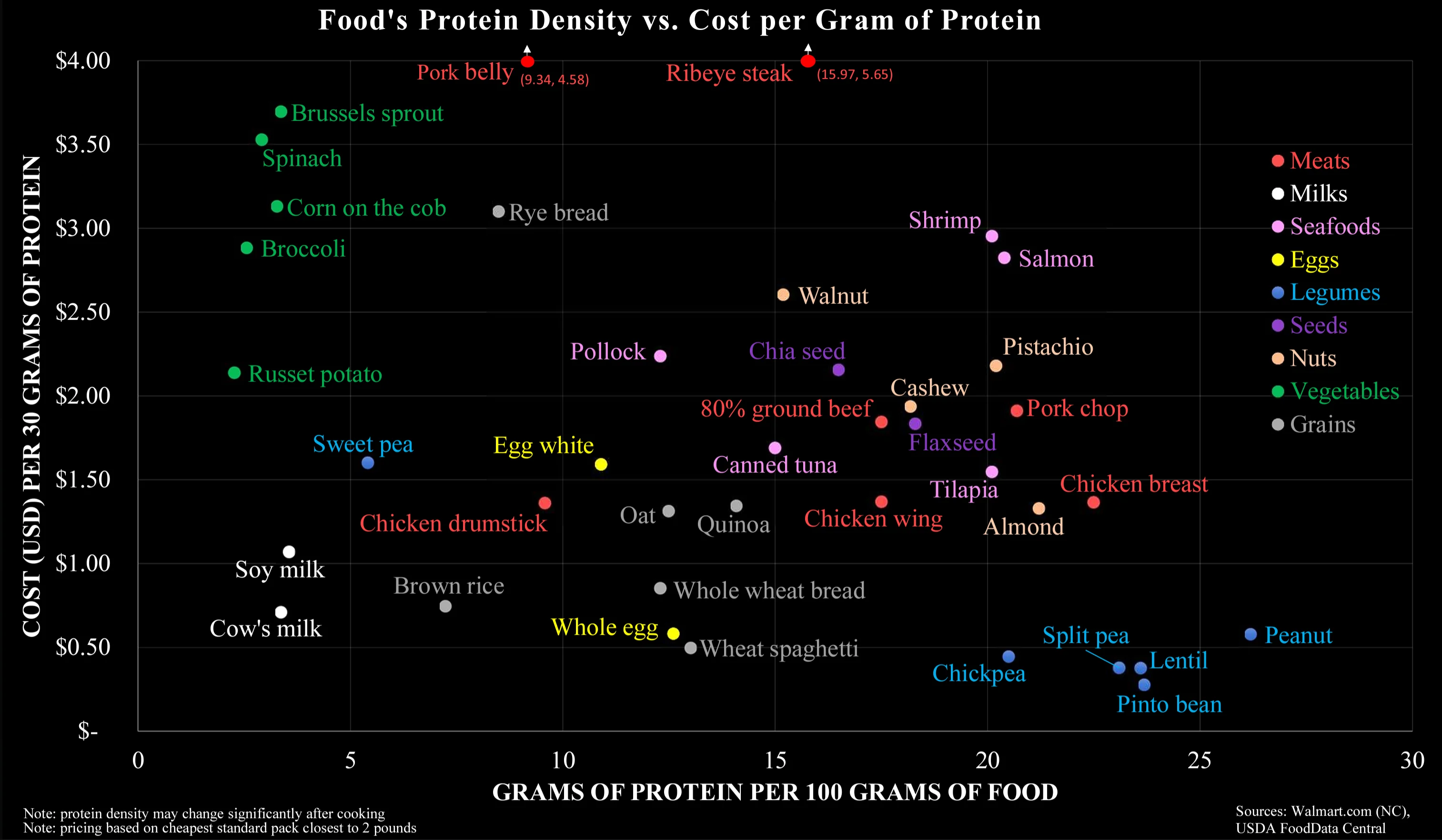
Beaver@lemmy.caBanned from community to Data Is Beautiful@lemmy.mlEnglish · 2 years agoCost by Protein Sourcelemmy.caimagemessage-square63linkfedilinkarrow-up1284arrow-down122
arrow-up1262arrow-down1imageCost by Protein Sourcelemmy.caBeaver@lemmy.caBanned from community to Data Is Beautiful@lemmy.mlEnglish · 2 years agomessage-square63linkfedilink
minus-squaremonomon@programming.devlinkfedilinkarrow-up1·2 years agoIt’s not that they are separated on the chart, but that they are comparable (on both axes), that impressed me.


It’s not that they are separated on the chart, but that they are comparable (on both axes), that impressed me.