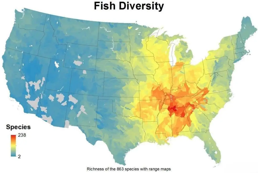
It’s a misleading legend, but the note at the bottom tries to clear it up a bit. This map seems to more be like “We took the range maps of 238 species of fish and overlaid them. The red area is where practically all of those range maps of each 238 species of fish overlapped.” Of course there are other fish, but they were not included here because the map maker didn’t have the right kind of dataset for them. To me that seems to indicate that this map isn’t so much a map of actual biodiversity measured, but the potential for biodiversity of the region. Given that it’s fish, I guess we shouldn’t be surprised that this area is somewhere between/near the northern continent’s biggest river, a large gulf, and ancient mountain range, and a coast with a strong warm current (for now…).


It’s a misleading legend, but the note at the bottom tries to clear it up a bit. This map seems to more be like “We took the range maps of 238 species of fish and overlaid them. The red area is where practically all of those range maps of each 238 species of fish overlapped.” Of course there are other fish, but they were not included here because the map maker didn’t have the right kind of dataset for them. To me that seems to indicate that this map isn’t so much a map of actual biodiversity measured, but the potential for biodiversity of the region. Given that it’s fish, I guess we shouldn’t be surprised that this area is somewhere between/near the northern continent’s biggest river, a large gulf, and ancient mountain range, and a coast with a strong warm current (for now…).
Thanks for the additional info!